I'd like to find a way of emphasising the date labels (the 00:00 point) to make it stand out from the rest of the labels - particularly when the graph is viewed on a small phone/tablet screen where the text of the labels is not easy to read.
The code is:
Code: Select all
var doTemp = function () {
    var freezing = config.temp.units === 'C' ? 0 : 32;
    var options = {
	chart: {
	    renderTo: 'chartcontainer',
	    type: 'line',
	    alignTicks: false
	},
	title: {text: 'Temperature'},
	credits: {enabled: false},
[b]	xAxis: {
	    type: 'datetime',
	    ordinal: false,
	    dateTimeLabelFormats: {
		day: '%e %b',
		week: '%e %b %y',
		month: '%b %y',
		year: '%Y'[/b]
	    }
	},
	yAxis: [{
		// left
		title: {text: 'Temperature (°' + config.temp.units + ')'},
		opposite: false,
		labels: {
		    align: 'right',
		    x: -5,
		    formatter: function () {
			return '<span style="fill: ' + (this.value <= freezing ? 'blue' : 'red') + ';">' + this.value + '</span>';
		    }
		},
		plotLines: [{
			// freezing line
			value: freezing,
			color: 'rgb(0, 0, 180)',
			width: 1,
			zIndex: 2
		    }]
	    }, {
		// right
		linkedTo: 0,
		gridLineWidth: 0,
		opposite: true,
		title: {text: null},
		labels: {
		    align: 'left',
		    x: 5,
		    formatter: function () {
			return '<span style="fill: ' + (this.value <= 0 ? 'blue' : 'red') + ';">' + this.value + '</span>';
		    }
		}
	    }],
	legend: {enabled: true},
	plotOptions: {
	    series: {
		dataGrouping: {
		    enabled: false
		},
		states: {
		    hover: {
			halo: {
			    size: 5,
			    opacity: 0.25
			}

		    }
		},
		cursor: 'pointer',
		marker: {
		    enabled: false,
		    states: {
			hover: {
			    enabled: true,
			    radius: 0.1
			}
		    }
		}
	    },
	    line: {lineWidth: 2}
	},
	tooltip: {
	    shared: true,
	    crosshairs: true,
	    valueSuffix: ' °' + config.temp.units,
	    valueDecimals: config.temp.decimals,
	    xDateFormat: "%A, %e %b, %H:%M"
	},
	series: [{
		name: 'Temperature',
		zIndex: 99
	    }, {
		name: 'Dew Point',
		visible: false
	    }, {
		name: 'Apparent',
		visible: false
	    }, {
		name: 'Wind Chill',
		visible: false
			}, {
		name: 'Heat Index',
		visible: false
	    }, {
		name: 'Inside'
	    }],
	rangeSelector: {
	    buttons: [{
		    count: 6,
		    type: 'hour',
		    text: '6h'
		}, {
		    count: 12,
		    type: 'hour',
		    text: '12h'
		}, {
		    type: 'all',
		    text: 'All'
		}],
	    inputEnabled: false
	}
    };

    chart = new Highcharts.StockChart(options);
    chart.showLoading();

    $.ajax({
	url: 'tempdata.json',
	cache: false,
	dataType: 'json',
	success: function (resp) {
	    chart.hideLoading();
	    chart.series[0].setData(resp.temp);
	    chart.series[1].setData(resp.dew);
	    chart.series[2].setData(resp.apptemp);
	    chart.series[3].setData(resp.wchill);
	    chart.series[4].setData(resp.heatindex);
	    chart.series[5].setData(resp.intemp);
	}
    });
};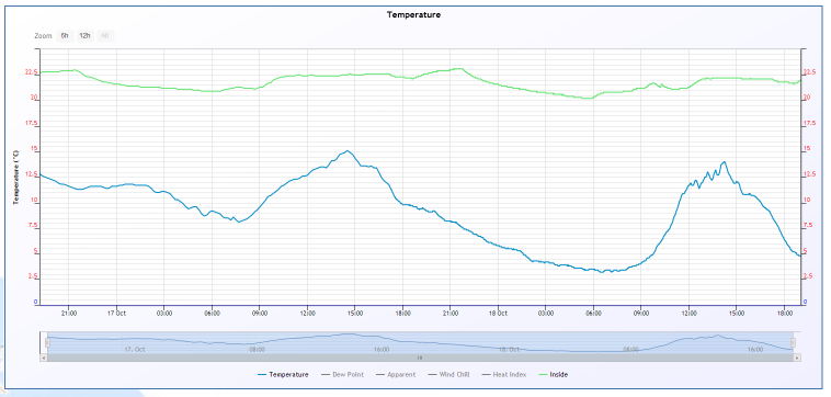
It would be useful if the labels "17 Oct" and "18 Oct" could be displaced vertically (eg with a longer tick mark), and made bold or in a larger font - or both. Can this be done?